Introducing Arthur Lawrence 2.0
exceptional. repeat.
A glimpse
at our evolution
We have always embraced change, yet our focus has remained
constant through the years: delivering exceptional value. Here’s
what our recent brand transformation entails and what it means to us.

The Why
Behind Our Transformation
Undertaking Arthur Lawrence’s repositioning exercise is a thoughtful and conscious decision to ensure that important strategic changes taken place in the last decade are clearly translated into our brand and the way we talk about ourselves.
The new positioning is reflective of our multifaceted organization evolved over the years; conveys a unified look and strengthens our stance as an entity that lives and breathes exceptional work.
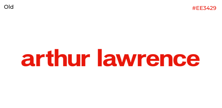
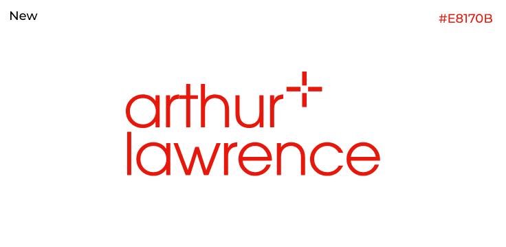
Our
NEW WordMark
Subtle but sleek modifications that incorporate our new direction.


ITC Avant Garde Gothic
Primary Font
The primary logotype uses a display font namely ITC Avant Garde Gothic. It is recommended to extend the logotype usage to a versatile, complementing secondary font family in brand collaterals; the secondary typeface is Century Gothic.


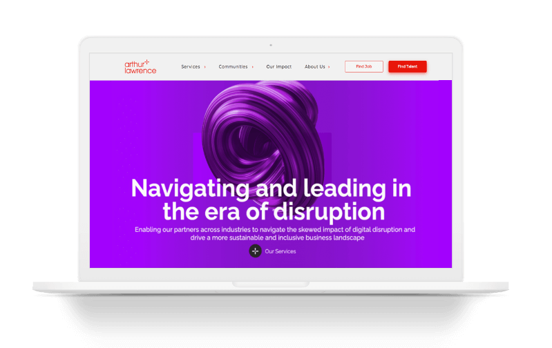
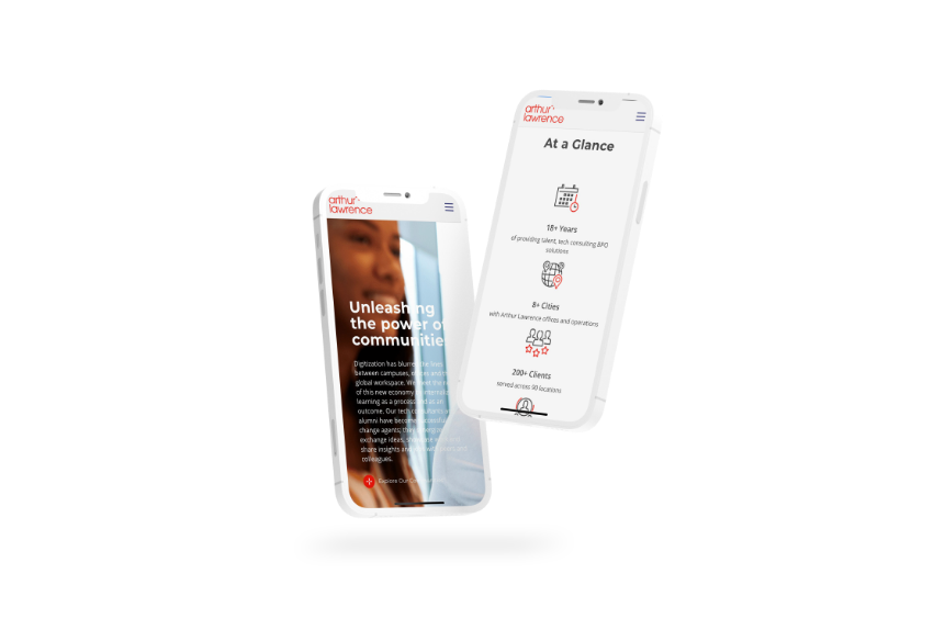
BRAND
COLLATERALS
This is how our new brand identity appears across various digital and print collaterals.